CASE STUDY
ForumGo
Redesigning a voting experience to improve candidate comparison, selection feedback, review, and confidence before submission.

PROBLEM
The challenge
ForumGo is a voting experience for selecting event candidates or speakers. The main issue was not whether users could technically vote, but whether they could do so with confidence. The interface offered limited support for comparison, weak feedback after selection, and insufficient reassurance before confirmation.
- Limited candidate comparison
- Selection feedback was too subtle
- Confirmation felt uncertain
EVIDENCE
What the research revealed
Comparison was limited
Evidence: The flow did not surface side-by-side context for choosing between candidates.
Impact: Users felt uncertain when making their final selection.
Selection feedback was weak
Evidence: Selection states lacked visible feedback and confirmation.
Impact: Users did not know if their choice was actually registered.
Review needed reinforcement
Evidence: The flow moved toward submission without a clear review step.
Impact: Users felt rushed and uncertain before the final vote.
DECISIONS
Design response
Evidence shaped a tighter voting flow so users can compare, select, review, and submit with confidence.
Candidate comparison was limited.
Enable Compare when two or three candidates are selected.
Users can review their options before committing to a vote.
Selection feedback was weak.
Make selected states explicit throughout the flow.
Users always understand what is active and what can still be changed.
Confirmation felt uncertain.
Strengthen the review step and final confirmation state.
Users receive clear reassurance before and after submitting the vote.
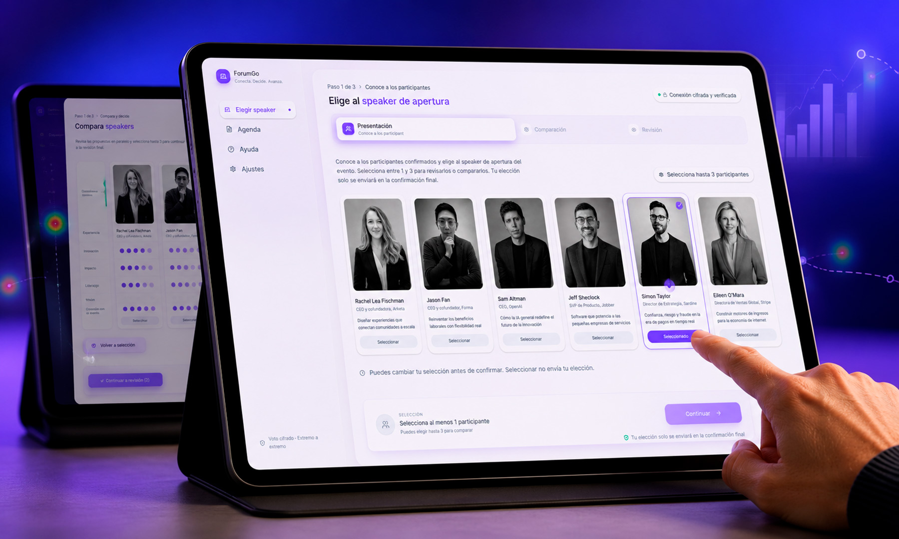
FINAL INTERACTION FLOW
VALUE
Outcome & learning
The redesign addresses core usability issues by making comparison, selection status, review, and confirmation more explicit. It creates a clearer interaction model and a stronger foundation for future validation.
- Task completion alone is not enough; confidence matters.
- Evidence should directly shape design priorities.
- Responsive clarity is part of usability, not an afterthought.