CASE STUDY
Subtrack
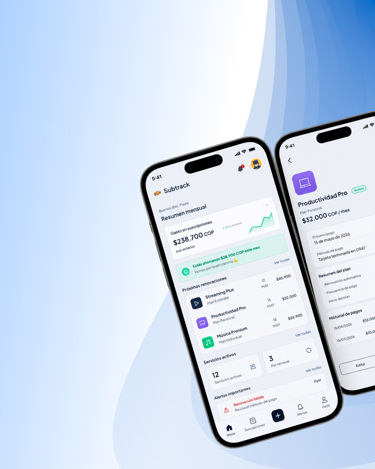
Creating a responsive subscription-management interface that turns recurring payments, renewals, and savings opportunities into a clearer system.
PROBLEM
The challenge
Subscription information is often distributed across receipts, banking apps, and individual service accounts. The interface needed to consolidate recurring costs without becoming another dense financial dashboard, while preserving clear priorities across desktop, tablet, and mobile.
- Monthly spending was difficult to understand as a whole.
- Renewal, payment, and cancellation states competed for attention.
- Dense desktop information needed a coherent responsive behavior.
EVIDENCE
What the interface definition revealed
Cost needed a single overview
Evidence: Individual subscription cards did not communicate total monthly impact or near-term spending.
Impact: Users could review services without understanding the broader financial picture.
Renewal states needed hierarchy
Evidence: Active, upcoming, failed, and cancellation-related states required different levels of urgency.
Impact: Treating every item equally would make time-sensitive actions harder to scan.
Repeated content required a system
Evidence: Cards, filters, prices, badges, and payment details recur across multiple views and breakpoints.
Impact: One-off styling would introduce inconsistency and make responsive refinement slower.
DECISIONS
Design response
The interface organizes subscription management around overview, urgency, and reusable behavior rather than presenting every piece of data with equal visual weight.
Recurring costs were fragmented across individual services.
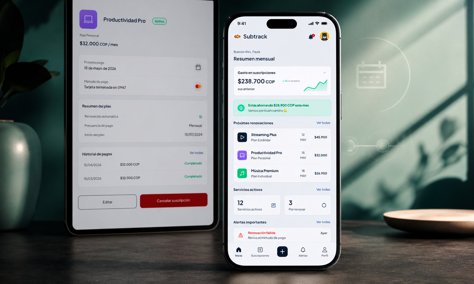
Create a dashboard with monthly spending, upcoming renewals, active services, and estimated savings.
Users gain an immediate view of what they pay, what renews next, and where action may be useful.
Subscription states carry different levels of urgency.
Use consistent semantic badges, dates, alerts, and action patterns for each state.
Users can distinguish routine information from failed payments or upcoming renewals more quickly.
Desktop density could not simply be compressed on smaller screens.
Build adaptive list-and-detail layouts from shared components and prioritized fields.
The same core tasks remain understandable without preserving unnecessary desktop density.
CORE MANAGEMENT FLOW
VALUE
Outcome & learning
The result is a reusable UI foundation that consolidates subscription data, differentiates operational states, and adapts information density across screen sizes. The project demonstrates how a component system can support clarity rather than functioning only as a production asset.
- Clear hierarchy matters more than displaying every available detail at once.
- Semantic states should remain consistent across cards, lists, and detail views.
- Responsive design decisions belong inside the component model from the beginning.